Facebook really loves to play Popularity Police. If you don’t like enough of a Page’s posts, they stop showing in […]
GDBD: The AllRecipes Cross-Platform Ecosystem
Good Design Bad Design, Web Design
February 22nd, 2011
First, let me just say that I hate cooking. There’s work on either end, usually while hungry on the one side and lazy on the other. To me, the only thing worse than cooking is all the dishes you have to do afterwards. Anyway, I’ve found the AllRecipes apps are so well designed, the geek in me is soothed enough to make the cooking experience much more pleasant; almost, dare I say it, enjoyable.

The Verdict: Good Design!
The Takeaways:
- Designing for the total user experience is more relevant than ever with cross-platform applications, and doing a good job at this makes both Web and smartphone applications stand out above the competition.
- Excellent cross-platform functionality makes other design flaws easier to forgive.
- Leveraging communities brings additional value to information which could otherwise be found elsewhere.
The Details
AllRecipes has done a fantastic job of integrating their website, which clearly came first, with their iPad and iPhone apps. Keep Reading
Critique: Bit.ly’s Fugu Redesign
May 3rd, 2010
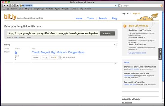
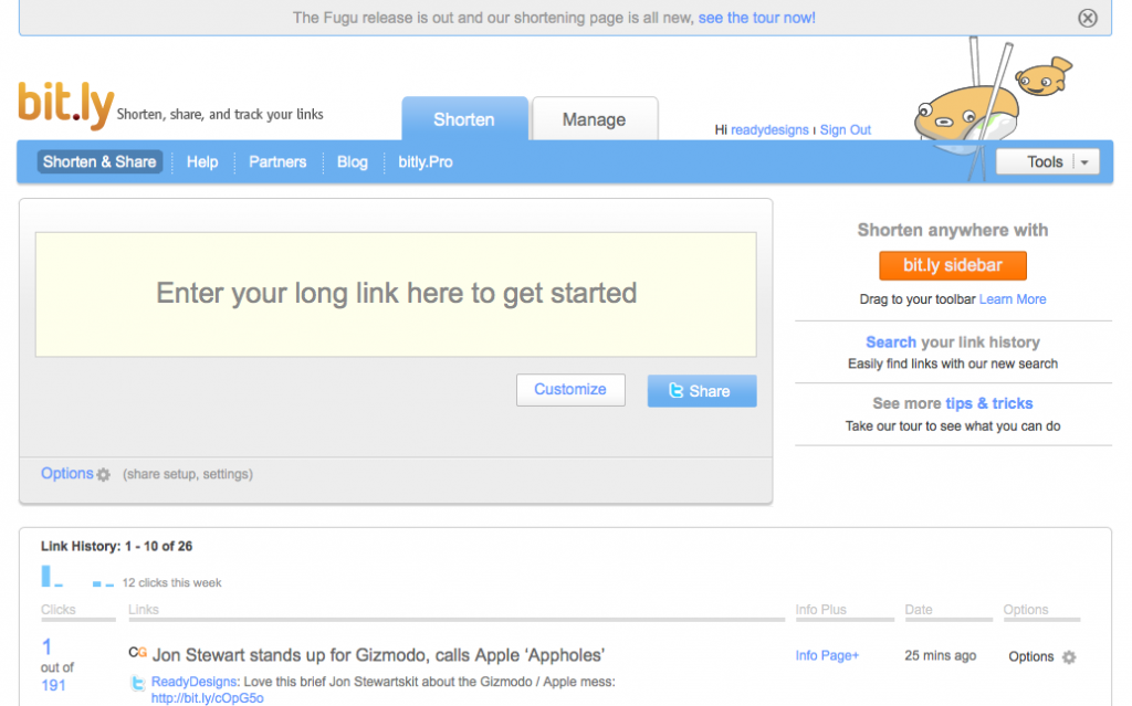
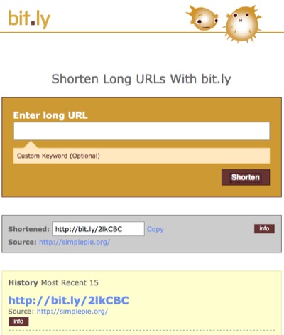
It appears the redesign bug is going around. Just a couple of weeks ago one of my favorite online services, Pandora Radio, tweaked their site design. Now Bit.ly, another of my most frequented sites, has revamped their interface as well in what they’re calling the Fugu edition. Below is a screenshot of the site as it looked last Friday, followed by one taken this evening.
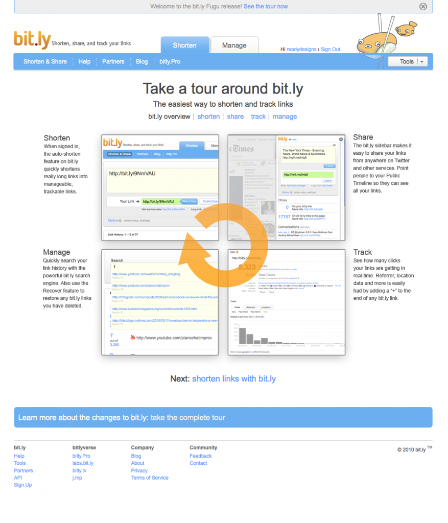
My initial reaction to their redesign was negative, though that didn’t last more than a few moments; I liked the simplicity of the previous design, and the change caught me off-guard. After I did a quick double-take of the URL and got over my culture-shock, I decided to take a look at what’s changed. Fortunately for me, Bit.ly set up a largely visual tour of their features for new and returning visitors – this is the first change and surely a positive one.
Making Their Services Obvious
The first page of the tour makes it instantly clear what URL shortening is all about, and that this particular URL shortening site has a lot to offer beyond just creating smaller links. Searching and tracking of previously shortened links along with a handy sidebar widget are all features which, I believe, existed before. Now, however, they are brought to the forefront both through the tour and on the homepage.
From the homepage, the reporting service is found under the second of just two tabs along the top, in a a lovely place of prominence on the Manage page. Meanwhile the new colors, positioning, and bolding draw attention to the widget and the search features in the sidebar, as well as a link to the tour. Bit.ly is plainly hoping to increase interaction across their site’s features and build value for themselves above their competitors. I’d like to see a link to reporting on the main page, and perhaps something more descriptive than “Manage” for the second tab, but I’d say they’re doing a good job overall.
Rating: 4 out of 5
Colors and What They Tell Us
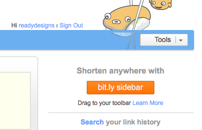
The color scheme hasn’t changed much, but the use to which those colors are being put has altered rather dramatically. The bright, friendly blue is now featured much more prominently. The gray behind the URL input is no longer flat, but a very “2.0ish” gradient. Bright orange complements the blue and draws the eye to the sidebar widget.
Examining the visual importance of the widget call-t0-action leads me to believe that Bit.ly is more concerned with users accessing and saving that widget than with users actually shortening URLs from the site. This makes sense, as a shortened URL is a completed action and does not necessarily indicate a return visit; a sidebar widget, however, practically guarantees that the visitor will use the service again.
The URL text field itself, the secondary call-to-action and most likely reason for a visit, is immense and not to be missed. Fortunately, the colors used for the text field are gentle and pleasing; it is obvious, but not overpowering.
Rating: 5 out of 5
Functionality
To be honest, all I did on Bit.ly before the redesign was paste my long URL, copy the shorter one, and leave, with the occasional five to ten seconds spared to see how many clicks my most recent shortened links got. It’s quite possible I’ll call something new that was actually here before. Either way, though, I’m taking notice of things I didn’t see before, which shows they did something right.
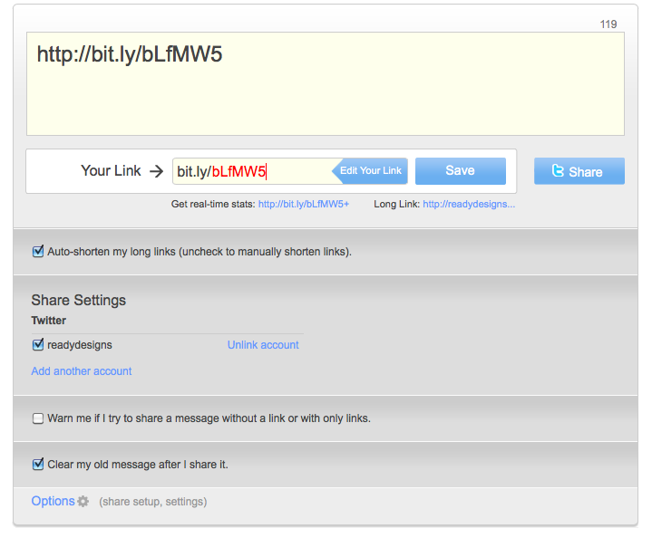
Bit.ly added the ability to tweet directly from the URL shorter text field, adding a character count to facilitate it and enabling linking of multiple Twitter accounts. This adds immense value to the service and the potential to speed up the URL shortening-using process even more. They also mention in the tour that Facebook integration is coming soon
I really like the slick new action animations on the site. They are understated and smooth but make the site more fun to interact with. “Fun” may seem trivial, but it’s a key component to reducing bounce rate and encouraging repeat visits.
Another nice feature, one which may have been around all along, is the ability to customize your shortened link into something human-readable – very cool.
Rating: 5 out of 5
Bit.ly Pro?
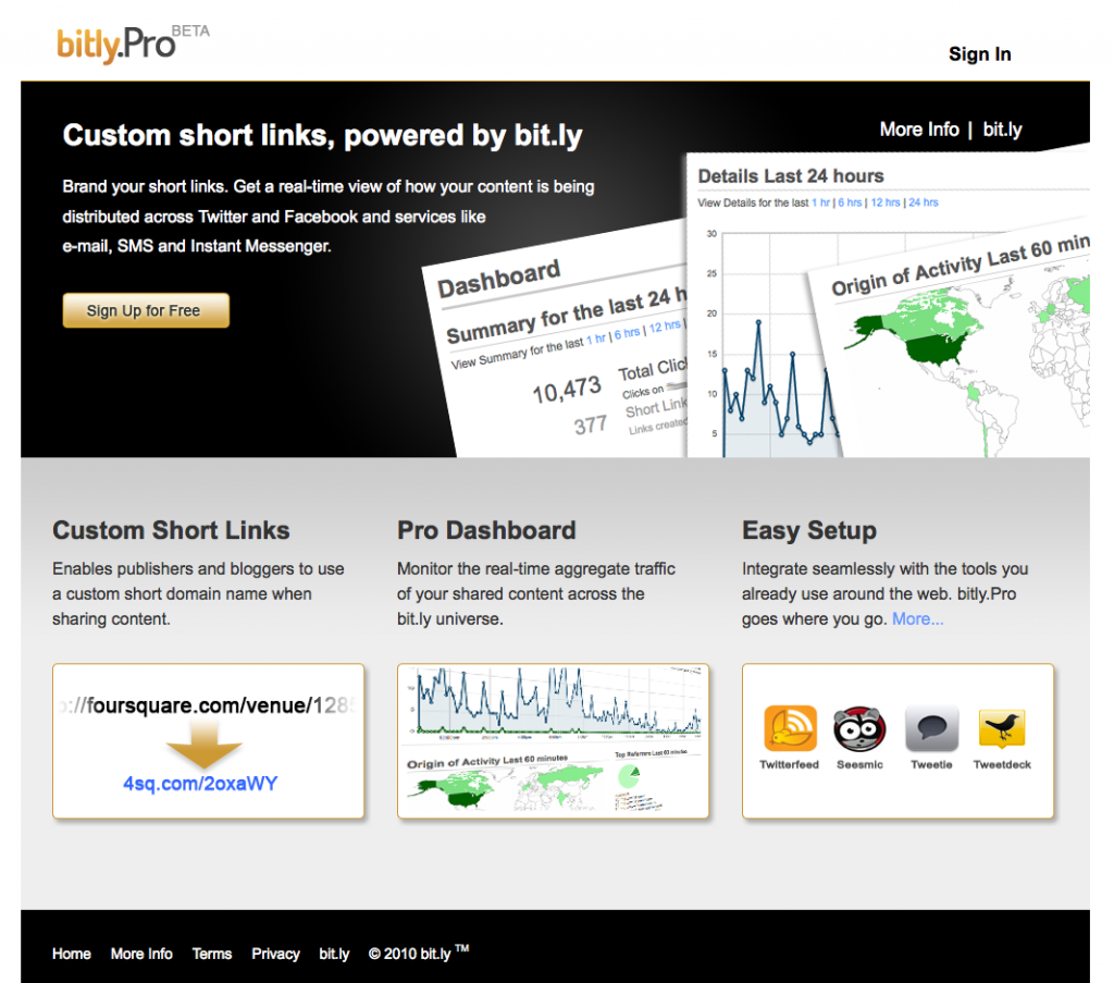
A final intriguing addition that I’ll mention is a link along the top to Bit.ly Pro. Clicking on this link leads the visitor to Bit.ly Pro Beta, a (very black and dramatic) page that doesn’t immediately make clear what differentiates it from Bit.ly standard. Being the curious sort of user that I am, I clicked on the “Sign Up for Free” button, but it seems their beta program is currently closed. The “More Info” page is rather vague, so I guess I’ll have to wait a while to see what nifty features are being demoed in Pro and the briefly mentioned paid Pro Enterprise versions.
Rating: ?
Edit: I’m a bit tired, so I missed the Bit.ly blog post detailing just what Bit.ly Pro does. Oops!
Conclusion
The new changes add relevancy to the Social Web and make the site’s advanced features more readily apparent and appealing.
I’ve been using and enjoying Bit.ly for only about six months now, and over that time I’ve already developed an affection for the efficient, friendly site. The recent changes show that Bit.ly is concerned with staying relevant and continuing to add value to their site. This, coupled with a healthy dose of TLC on the part of the developers that shows through the site’s interface, has only served to cement that affection. Well done, Bit.ly! Keep up the good work (and let me into your new beta! ;)
I’d love to hear your thoughts on the design. Did I miss any important points? Don’t be shy to leave a comment below!
“Cousin Bob Can Do HTML”
A Common Objection
March 21st, 2010
I’ve heard it from friends, family, and potential clients: “My wife/nephew/son can build a Web site for my business, so I don’t need to hire anyone.” As a Web designer myself, I hate hearing this, but not just because it’s one more person I’ll never be able to call a client. I hate hearing it because I know that 99.9% of the time it’s downright wrong. That business will probably never get anything out of their Web site besides being able to say it has one.
Building a successful Web site requires more than writing some code (or building something in a WYSIWYG) and throwing it at the Internet. With current Web technologies, virtually anyone can build a Web site and get it hosted in under an hour, but that site will probably not do a business any good. A successful Web site must be well-designed for usability, it must be well-coded for functionality, and it must be optimized for search-ability. Without any one of these highly complex facets, a site is not fulfilling its potential and can potentially even do harm to the business.
Consider, for instance, that Web sites are often a business’ first portal of entry for potential customers. People often visit a business online before traveling to its brick-and-mortar location. Visitors will associate the business with their experience on that site; if it is frustrating to use or unprofessional in appearance, that stigma can carry over onto the business itself. This isn’t to say that a bad Web site will spell doom for a business; however, a well-designed site has the potential to engage customers in ways that can permanently enhance their opinion of the business, increasing brand-loyalty and ultimately spending.
As Web designers, we do our best to ensure that a Web site gives the best possible return on investment to our clients. It is our job to apply documented, researched, and tested principles of color, form, and function to present information in the most effective way while providing the best possible user experience. If Cousin Bob can build you a home page, can he also make sure it’s optimized for search engines to find? (As a hint, meta tags don’t count.) Can he explain the 80/20 Rule or the Aesthetics-Usability Effect? Can he tell you the pros and cons of using JavaScript or jQuery, or whether he’s using HTML, XML, or HTML5 and why? A well-designed Web site has a hundred other factors like these all woven together to make up a positive user experience that reflects well on the business.
Design, of Web sites or otherwise, is not an entirely subjective art as many people mistakenly believe; it is built on solid principles which can and do impact user experience and user behavior. There is art, but there is also science in the art. I’m not saying Cousin Bob doesn’t know at least a few things about Web sites; he very well might. What I am saying is that there are good reasons people go to school for, make a living at, and continue a lifelong study of Web design. Unless Bob is a professional, he won’t be able to give you that kind of value, and your site is unlikely to be anything more than an item checked off your business’ to-do list.
