Facebook really loves to play Popularity Police. If you don’t like enough of a Page’s posts, they stop showing in […]
Philanthroper Deal-a-Day Charity [Badges]
February 24th, 2011

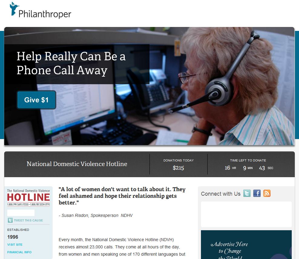
I’d like to take a moment to mention a lovely new charity startup called Philanthroper. They’ve taken the “daily deal” idea popularized by Groupon and turned it on its head, so that instead of paying for a coupon, visitors are presented with the option of donating to a different charity every day. To make it even better, they’re only asked to donate one dollar. The idea is, if enough people donate $1 it will add up quickly and allow thousands of ordinary folks to make a difference with very little personal expense.
Not only this, but the folks at Philanthroper don’t even take a cut of the donations for operating costs. They plan to support themselves entirely with advertisement revenue. The only cut goes to mPayy, which takes only $.01 per dollar for their own fee, substantially less than the leading online payment company, PayPal.
Unfortunately, I have yet to see a single advertisement on Philanthroper’s site. I contacted them to find out their rates, and sadly, they’re out of my budget range, but it got me thinking of ways they could improve aspects of their current marketing strategies. After all, better site stats mean more advertisers, and Internet marketing advice is one thing I can afford to give.
I posted the following suggestions on their discussions tab of their Facebook page. Keep in mind these were posted from my individual’s account, not as my business.
1) You need your daily deals newsletter subscription form way higher up the page. People shouldn’t have to look for it! Not only is it way below “the fold” of the page, it’s also below part of the footer – I almost didn’t notice the page kept going, so I almost never saw it! And believe me, if I didn’t get the daily email, I wouldn’t be remembering to check the daily deal. Why not stick it in the sidebar next to the deal?
2) In the emails, your link says “give $1”. I bet you anything that’s scaring people off! Notice how Groupon’s link says “see today’s deal” so people don’t feel like they’re committing to anything until they’ve read more about it. The first couple of times I clicked it, I was hesitant because I wasn’t sure if it would instantly donate or if I could read more before doing so. I bet a simple change in wording would get more people clicking through.
3) Also in the emails: Why so little info? I keep finding myself going “that *might* be worth it, but… meh…” and then it’s a 50/50 chance whether I’ll visit the site to find out. As it is now, half the email is telling me things I already know — and the top half, at that. If I’m subscribed to the email, I already know what you guys do. You don’t need to put your company’s mission statement at the top of the emails above the daily deal. If you added more info about the charity and put your own mission below that, you could make the charity the focus and make the email more valuable, while still reminding us of who you are and why you’re awesome.
They haven’t responded so I wonder if they’ve even noticed the post. Another fan continued the thread with some further suggestions, but has also gone unanswered.
I also reached out to them to do some volunteer work with them on making some promotional badges (this time via my business email), but again, I didn’t hear back. I finally made one myself to add to this site’s sidebar, and decided that unless Philanthroper objects, I should make it available to others.
Disclaimer: These are not officially endorsed by Philanthroper, and all relevant copyrights and trademarks remain with them.


These are hosted on Flickr. I recommend downloading them and hosting them yourself (hotlinking requires you to provide a link back to Flickr to keep with their terms of service). You can use the following code to create the badge, replacing “YOURIMAGESOURCE” with your image source:
I love what Philanthroper is doing, but I’m perplexed by their silence. Perhaps they’re simply too busy to respond? If so, maybe that’s actually a good sign.
Regardless, I wish them all the best of luck. It’s great to see people taking a concept like a daily deal and turning it around to support not one, but many worthy causes. Especially in tough economic times like these, sometimes $1 at a time is all any of us can manage, and yet charities need funding in tough times more than ever. Thank you, Philanthroper, for making that $1 matter.


Hey, this is Mark from Philanthroper!
First, I wanted to say thanks for all of this!
I’m actually shocked we didn’t email you back. We’re a small team, but generally I or my Lead Dev Bernerd respond to every email. I do remember seeing your facebook post. In that case, it was just a matter of, how do I respond to this? I can’t say I agree with it all, but at the same time, I appreciate the very fact that someone (especially a professional) is considering what we do so much. Could I say that without sounding like a jerk?
In cases like that, I pretty much just won’t say anything.
Anyway, I do want you to know that we are updating our mainpage with a pretty significant redesign – a v1.5 – that addresses at least one of your concerns and several we’ve heard since being online a month. It’s all-around better, but it doesn’t change the spirit, tone or general feel of our site.
As for the badges, what an awesome idea. Everyone is free to use them from our perspective. I would like to put you in touch with our design partners at UnitOneNine. They’re pretty intense about the brand’s presentation, and I’m sure they’ll have some simple tweaks to make them gel with what we’re working on.
Email me (mark@phil) and we’ll get you connected.
Last thing. No, we haven’t hosted an ad yet. But that absolutely doesn’t mean we’re going anywhere. All of us are in this for the long haul.
Best,
Mark Wilson
Founder, Panoramic Media
Mark, thanks so much for your response!
Perhaps my email simply went to the wrong person? It was a follow up to the conversation I was having about advertising on your site.
As for the Facebook post response, you certainly don’t sound like a jerk. I don’t expect everyone to agree with everything I say! I just wanted to offer up my own thoughts since I can’t support you monetarily right now. I figured with unsolicited advice, you can take what you want and leave the rest. ;) Perhaps with stuff like this in the future, a safe answer would be a simple “thanks, we’ll pass this on to our design team” to let people know you’re listening without making any promises or bruising any egos. Anyway, I’ll be excited to see the new site’s design.
I’ll be emailing you as soon as I finish this reply and look forward to talking with you and UnitOneNine. Thank you for offering to put me in touch with them. Again, best of luck to you and the Philanthroper team!