Facebook really loves to play Popularity Police. If you don’t like enough of a Page’s posts, they stop showing in […]
Critique: Bit.ly’s Fugu Redesign
May 3rd, 2010
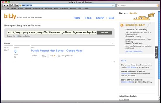
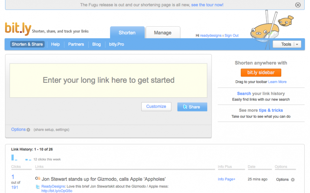
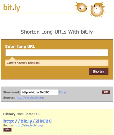
It appears the redesign bug is going around. Just a couple of weeks ago one of my favorite online services, Pandora Radio, tweaked their site design. Now Bit.ly, another of my most frequented sites, has revamped their interface as well in what they’re calling the Fugu edition. Below is a screenshot of the site as it looked last Friday, followed by one taken this evening.
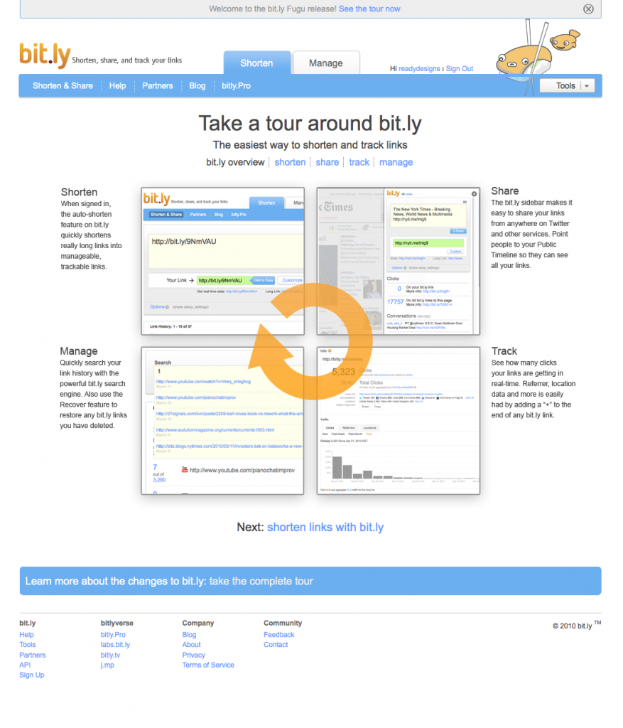
My initial reaction to their redesign was negative, though that didn’t last more than a few moments; I liked the simplicity of the previous design, and the change caught me off-guard. After I did a quick double-take of the URL and got over my culture-shock, I decided to take a look at what’s changed. Fortunately for me, Bit.ly set up a largely visual tour of their features for new and returning visitors – this is the first change and surely a positive one.
Making Their Services Obvious
The first page of the tour makes it instantly clear what URL shortening is all about, and that this particular URL shortening site has a lot to offer beyond just creating smaller links. Searching and tracking of previously shortened links along with a handy sidebar widget are all features which, I believe, existed before. Now, however, they are brought to the forefront both through the tour and on the homepage.
From the homepage, the reporting service is found under the second of just two tabs along the top, in a a lovely place of prominence on the Manage page. Meanwhile the new colors, positioning, and bolding draw attention to the widget and the search features in the sidebar, as well as a link to the tour. Bit.ly is plainly hoping to increase interaction across their site’s features and build value for themselves above their competitors. I’d like to see a link to reporting on the main page, and perhaps something more descriptive than “Manage” for the second tab, but I’d say they’re doing a good job overall.
Rating: 4 out of 5
Colors and What They Tell Us
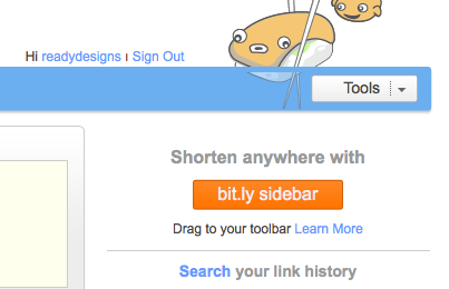
The color scheme hasn’t changed much, but the use to which those colors are being put has altered rather dramatically. The bright, friendly blue is now featured much more prominently. The gray behind the URL input is no longer flat, but a very “2.0ish” gradient. Bright orange complements the blue and draws the eye to the sidebar widget.
Examining the visual importance of the widget call-t0-action leads me to believe that Bit.ly is more concerned with users accessing and saving that widget than with users actually shortening URLs from the site. This makes sense, as a shortened URL is a completed action and does not necessarily indicate a return visit; a sidebar widget, however, practically guarantees that the visitor will use the service again.
The URL text field itself, the secondary call-to-action and most likely reason for a visit, is immense and not to be missed. Fortunately, the colors used for the text field are gentle and pleasing; it is obvious, but not overpowering.
Rating: 5 out of 5
Functionality
To be honest, all I did on Bit.ly before the redesign was paste my long URL, copy the shorter one, and leave, with the occasional five to ten seconds spared to see how many clicks my most recent shortened links got. It’s quite possible I’ll call something new that was actually here before. Either way, though, I’m taking notice of things I didn’t see before, which shows they did something right.
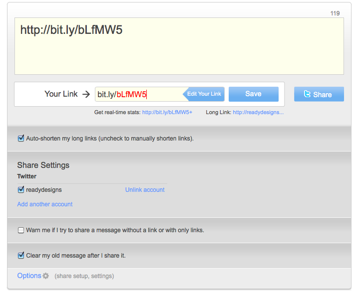
Bit.ly added the ability to tweet directly from the URL shorter text field, adding a character count to facilitate it and enabling linking of multiple Twitter accounts. This adds immense value to the service and the potential to speed up the URL shortening-using process even more. They also mention in the tour that Facebook integration is coming soon
I really like the slick new action animations on the site. They are understated and smooth but make the site more fun to interact with. “Fun” may seem trivial, but it’s a key component to reducing bounce rate and encouraging repeat visits.
Another nice feature, one which may have been around all along, is the ability to customize your shortened link into something human-readable – very cool.
Rating: 5 out of 5
Bit.ly Pro?
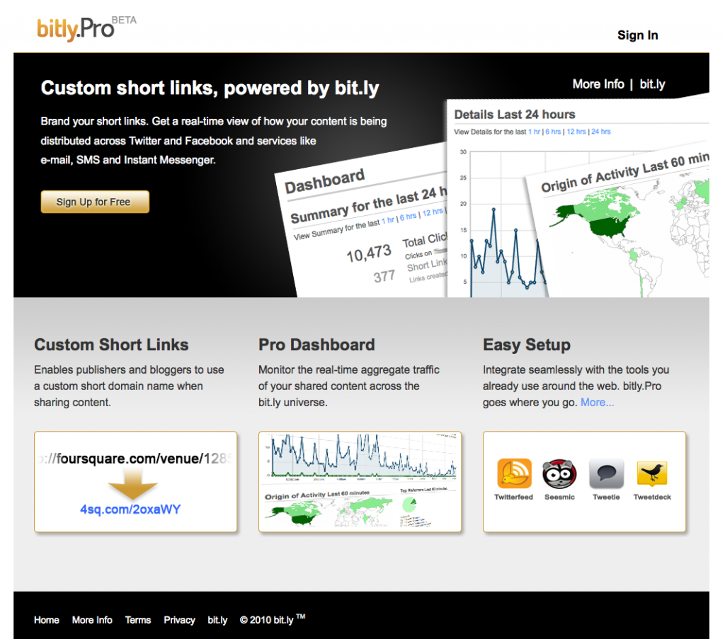
A final intriguing addition that I’ll mention is a link along the top to Bit.ly Pro. Clicking on this link leads the visitor to Bit.ly Pro Beta, a (very black and dramatic) page that doesn’t immediately make clear what differentiates it from Bit.ly standard. Being the curious sort of user that I am, I clicked on the “Sign Up for Free” button, but it seems their beta program is currently closed. The “More Info” page is rather vague, so I guess I’ll have to wait a while to see what nifty features are being demoed in Pro and the briefly mentioned paid Pro Enterprise versions.
Rating: ?
Edit: I’m a bit tired, so I missed the Bit.ly blog post detailing just what Bit.ly Pro does. Oops!
Conclusion
The new changes add relevancy to the Social Web and make the site’s advanced features more readily apparent and appealing.
I’ve been using and enjoying Bit.ly for only about six months now, and over that time I’ve already developed an affection for the efficient, friendly site. The recent changes show that Bit.ly is concerned with staying relevant and continuing to add value to their site. This, coupled with a healthy dose of TLC on the part of the developers that shows through the site’s interface, has only served to cement that affection. Well done, Bit.ly! Keep up the good work (and let me into your new beta! ;)
I’d love to hear your thoughts on the design. Did I miss any important points? Don’t be shy to leave a comment below!

