Facebook really loves to play Popularity Police. If you don’t like enough of a Page’s posts, they stop showing in […]
MIX11: Crafty UX – UX Lightening Series
April 13th, 2011
Liveblog of “Crafty UX – UX Lightening Series”, an hour long session with four speakers presenting at “lightening” speed. Sarah Summers, Nathan Moody, Robert Tuttle, and Guido Rosso will each present a 10 minute talk about UX.
Session video now posted on Microsoft’s Channel 9:
As this is a liveblog, please remember to read from the bottom, up. Keep Reading
Odd Coupon Design Placement?
March 2nd, 2011
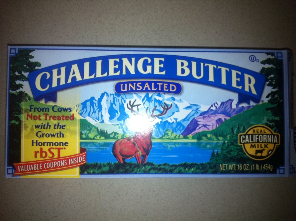
What do coupons have to do with growth hormones? In this case, nothing, and it actually made me bark a little laugh when I saw them linked so closely together. It was as if the coupons were somehow to get me hormone-free butter (or cows) as opposed to what was actually in the box — like a mail-in cereal box prize. Keep Reading
Philanthroper Deal-a-Day Charity [Badges]
February 24th, 2011
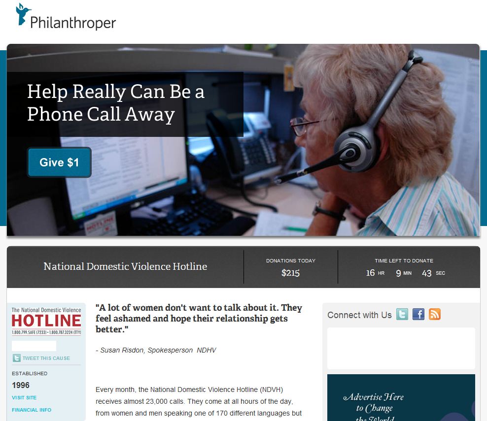
I’d like to take a moment to mention a lovely new charity startup called Philanthroper. They’ve taken the “daily deal” idea popularized by Groupon and turned it on its head, so that instead of paying for a coupon, visitors are presented with the option of donating to a different charity every day. To make it even better, they’re only asked to donate one dollar. The idea is, if enough people donate $1 it will add up quickly and allow thousands of ordinary folks to make a difference with very little personal expense. Keep Reading
GDBD: The AllRecipes Cross-Platform Ecosystem
Good Design Bad Design, Web Design
February 22nd, 2011
First, let me just say that I hate cooking. There’s work on either end, usually while hungry on the one side and lazy on the other. To me, the only thing worse than cooking is all the dishes you have to do afterwards. Anyway, I’ve found the AllRecipes apps are so well designed, the geek in me is soothed enough to make the cooking experience much more pleasant; almost, dare I say it, enjoyable.
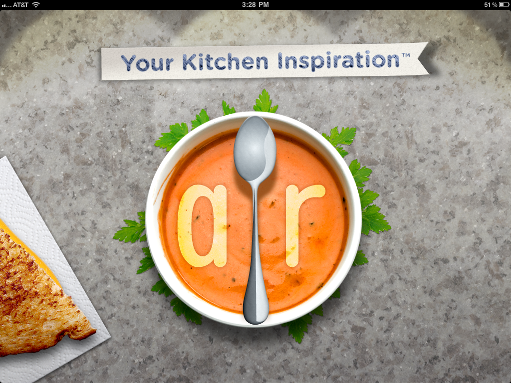
The Verdict: Good Design!
The Takeaways:
- Designing for the total user experience is more relevant than ever with cross-platform applications, and doing a good job at this makes both Web and smartphone applications stand out above the competition.
- Excellent cross-platform functionality makes other design flaws easier to forgive.
- Leveraging communities brings additional value to information which could otherwise be found elsewhere.
The Details
AllRecipes has done a fantastic job of integrating their website, which clearly came first, with their iPad and iPhone apps. Keep Reading
Facebook Pages Update, Lose Width… Again
February 10th, 2011
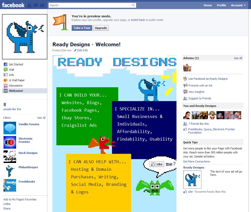
Facebook is rolling out yet another change to the Pages feature, which is optional for now but will be pushed on March 1, 2011. Keep Reading
Ready Designs Redesign Sneak Peek
January 25th, 2011
I’ve been threatening a redesign for weeks now, so I thought I’d toss up a little “mood snippet” (as opposed to a full mood board) as a sneak peek of what’s coming. Enjoy!
