Facebook really loves to play Popularity Police. If you don’t like enough of a Page’s posts, they stop showing in […]
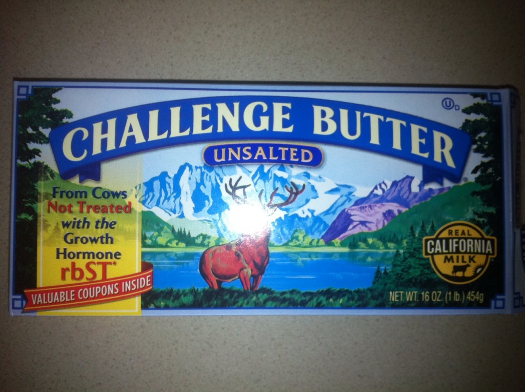
Odd Coupon Design Placement?
March 2nd, 2011
What do coupons have to do with growth hormones? In this case, nothing, and it actually made me bark a little laugh when I saw them linked so closely together. It was as if the coupons were somehow to get me hormone-free butter (or cows) as opposed to what was actually in the box — like a mail-in cereal box prize. Keep Reading
GDBD: The AllRecipes Cross-Platform Ecosystem
Good Design Bad Design, Web Design
February 22nd, 2011
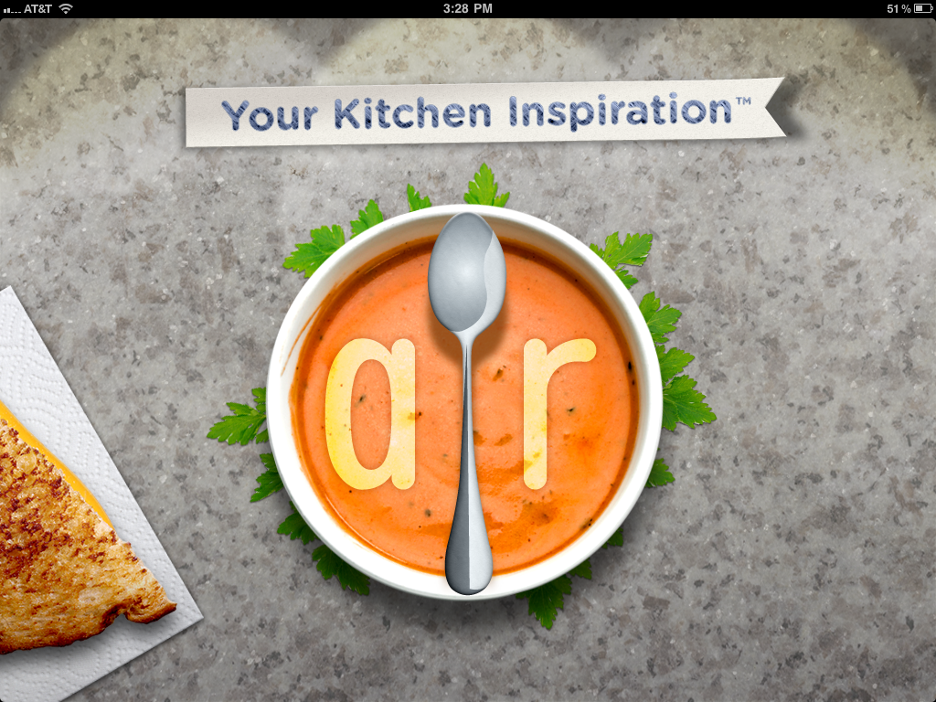
First, let me just say that I hate cooking. There’s work on either end, usually while hungry on the one side and lazy on the other. To me, the only thing worse than cooking is all the dishes you have to do afterwards. Anyway, I’ve found the AllRecipes apps are so well designed, the geek in me is soothed enough to make the cooking experience much more pleasant; almost, dare I say it, enjoyable.
The Verdict: Good Design!
The Takeaways:
- Designing for the total user experience is more relevant than ever with cross-platform applications, and doing a good job at this makes both Web and smartphone applications stand out above the competition.
- Excellent cross-platform functionality makes other design flaws easier to forgive.
- Leveraging communities brings additional value to information which could otherwise be found elsewhere.
The Details
AllRecipes has done a fantastic job of integrating their website, which clearly came first, with their iPad and iPhone apps. Keep Reading
GDBD: Bamboo Cat Grooming Glove
January 22nd, 2011

The Verdict: Good Design!
The Takeaway: As designers, we need to remember to go beyond the basics and think about the total user experience to always optimize, optimize, optimize!
The Details: The Bamboo Cat Grooming Glove is a rubbery cat accessory designed to work for both wet and dry grooming. It has two depths of bumpy rubber knobs on the “brush” side and a fuzzy cloth patch on the other for picking up loose fur.
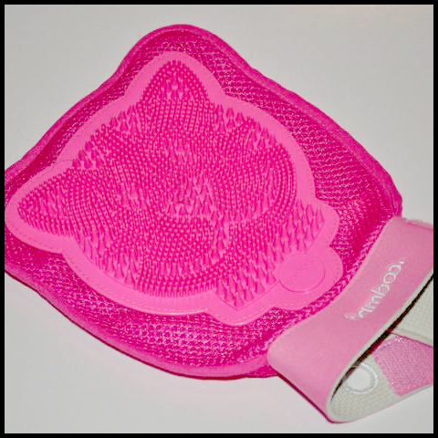
This product impressed me enough to write about it for one primary reason: Inside the glove attached to each side is a strap for holding smaller hands in place. This means the product designers thought about the needs of their entire user base, instead of just making assumptions based on their own or “average” hand sizes, or making multiple products for various users. Keep Reading
GDBD: Good Design, Bad Design
January 22nd, 2011
Ok, so I’m a designer, right? I go through my day and I see all kinds of little things that either drive me crazy or impress me with their design — and as an effort to get more in the designer headspace, I’m trying to notice them even more. Unfortunately, sometimes my husband just doesn’t get it when I start analyzing the layout of a billboard or crooning over the ergonomic rubber grip of a new kitchen utensil. Rather than boring him with all the gory details, I’ve decided to do a new little now-and-again segment here called “Good Design, Bad Design” (GDBD for short), in which I look at products, software, or whatever strikes my fancy and point out how awesome they are, or how much they suck and why.
I’m not trying to minimize the effort put in by the various product designers and UI experts out there, nor am I presuming my stamp of approval on their awesomeness means diddly squat. But just like a painter sees the world through a lens of composition and color palettes and a photographer starts thinking often of depth-of-field and lighting, as a designer, I’ve started seeing the world in terms of usability, aesthetics, and problem solving, and doing so helps me to do my own job better.
So, without further ado, I’ll get on to work on my first post in the GDBD series…

