Ready Designs

4 8-bit dragons in a line

Total Experience Design – Why Should a Web Designer Care?

Web Design

August 7th, 2010

Paul Dawson of EMC Consulting

Paul Dawson of EMC Consulting

This is a guest post graciously contributed by Paul Dawson, who spoke at MIX10 about Total Experience Design. He runs a consulting blog and is Experience Director at EMC Consulting, one of the largest digital interactive agencies in Europe and about to go global. EMC bought Paul’s previous company, Conchango, about three years ago. He’s been in “new media” since it was — “new” that is, working on early day websites and multimedia work from 1996. Now he works with clients like Tesco, Virgin Atlantic and Barclays on digital experience strategies, as well as making the rounds talking about EMC Consulting’s approach to design; particularly their “Total Experience Design” philosophy. Keep Reading

Tweeting MIX10: 10 Things I Learned Live-Blogging on Twitter

Communication Concepts

March 19th, 2010

ReadyDesigns 396 TweetsWhen I went to Microsoft MIX10, I thought I would try a little Twitter experiment. I had a virgin Twitter account newly created for my freelance business. It had no followers and no content, so I had nothing to lose by trying something different from the usual “here’s another list of logos” posts I usually find in design-oriented Twitter accounts (well, it’s usually either that or what kind of sandwich the designer had for lunch – not that I mind either one). Since I set up both that and my blog literally just weeks before MIX, I decided to hit the ground running by launching with MIX10 content. My plan was to live-blog the event, but on my Twitter account rather than my blog. I thought it would be a great way to build quality content fast; it’s something that would be relevant and searched, others would find it interesting and useful if they were unable to attend, and I’d be forced to spend a little more time digesting what I was experiencing. What I didn’t realize was that because of the sheer volume of tweets needed to effectively live-blog each session, I would have over 390 tweets at the end of just four days.


It proved to be a valuable experience, if an exhausting one. Along the way, I learned a few things about “live-tweeting” and how to live tweet.

1) Live-Tweeting helped me assimilate the content. Taking notes is helpful for remembering points and concepts, but tweeting every nugget of information actually forced me to digest it more deeply. Communicating a point to someone else (aka teaching) is one of the best ways to cement concepts, as it causes the brain to form deeper and more personal connections than in passive listening or note-taking. Although the communication in this case was rapid and succinct, I  came away with better recall of the sessions than I usually have.

2) Presentations actually distill pretty well into 140 character chunks, although some on-the-fly rewording/reorganizing was necessary. Most presentations are built around bullet points and memorable phrases, lending themselves to display as short snippets of information. However, simply tweeting bullets isn’t always enough to get the speaker’s point across, just as reading a slideshow without the talk usually isn’t very helpful. Sometimes a little creativity is required to provide value, and I felt that  was critical.

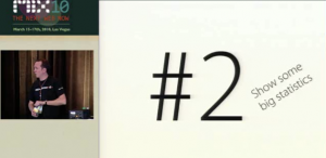
Paul Dawson's Presentation at MIX10

[Image Credit]

3) Live-Tweeting kept me in the mix. Since I was on my Twitter account nearly every minute I was at MIX10, I got to be a part of the larger conversations that took place under the #MIX10 tag throughout the conference. This was most entertaining during the big keynote events, when the conversation streamed past in a constant flow of opinions, comments, and informative tweets. I was instantly able to see what others thought was important, funny, or interesting in some way, which is interesting in itself. In addition, I felt like I was part of a much larger community experience, even though I never once during the keynotes themselves turned to comment directly to my neighbors. Later on, I also got to be a part of the very cool Fantastic Tavern Las Vegas event because I saw it being tweeted about.

4) Twitter tools are essential to get the most out of live-tweeting. I used Seesmic throughout most of MIX10, a tool which let me see @mentions, a search feed targeting MIX10, and my own sent messages simultaneously. This saved me from bouncing between tabs or pages to keep up with the bigger conversation, and kept me updated on mentions which I otherwise probably wouldn’t have noticed in time for them to be useful (in fact I did miss a couple on the first day before using Seesmic). I figured that live-tweeting has to be lightning fast to be useful, and there just isn’t time for all that page loading and swapping.

5) Copy-paste is a double edged sword. I used copy-paste to speed up my tweeting time. During each session, I had a notepad file open with the prefix I was using (in the format “#MIX10 Session Name: “) to save typing and keep consistency in my tweets. I usually copy-pasted from my session notes to the file, edited the note into a sensible, 140 character, content-packed tweet, and then copy-pasted that into my Twitter feed. I had one incident, however, when I was posting a list of 10 things which, unfortunately, had about three number sixes and I believe ended with a couple of number eights.

Broken Elmer's Glue Bottle

[Image Credit]

6) I should have suffixed, not prefixed my tweets with the session name. Looking over the tweets from the event, I find them much harder to skim than they otherwise would have been.With such short messages, just the session name (or shortened version) took up the first quarter to third of the tweet. At a quick glance, huge blocks look identical because readers have to scan into the middle of the tweets before they differ.

7) I needed a camera. Unfortunately, the only camera I have is a five year old, 5 mega-pixel digital fossil that not only produces grainy pictures, but utterly fails at wide or distance shots (most of what I would have been photographing). Pictures would have added color and context to the feed. In addition, there were a couple of times when a photograph of a slide would have saved me from losing information forever.

8) People did appreciate it. I was a bit worried that people would see my extreme number of tweets as spam, but the only feedback I received was positive. In fact, one person told me that he was watching one of my session tweets practically on the edge of his seat, wishing he had gone to that one instead. I went from about five spam and a couple of “thanks for following me” followers on day 1 to around 70 legitimately interested folks. It remains to be seen how many of these will stick around now that the event is over.

Hands Applauding

[Image Credit]

9) Live-Tweeting should probably never be done with a primary Twitter account. I’m certain I only received a positive reaction to such thorough live-blogging on Twitter because I had a fresh account with no followers. If I’d had followers to begin with, I’m sure I would have lost them all from the sheer volume of tweets. If I do something like this again, I’ll create a separate account dedicated to live-blogging only.

10) Live-Tweeting is exhausting. Between taking my own notes and keeping live-tweets flowing as close to real-time as I could, I felt like I’d run a marathon after every session. As I mentioned above, I felt that live-tweeting should be as fast as humanly possible, but I was also trying to process and output complicated points. By the end of the day, I was completely mentally worn out.

The long and short of it is, although I had no idea what I was getting into when I started, it was a valuable experience. I hope I’ll have the chance to go to other events soon so I can do it again; it was a lot of fun, kept me involved with the greater conversation, and helped me assimilate the information better than I otherwise would have. Oh yeah, and it won me the MIXrockstar prize, to boot!*

MIX Rockstar Contest

If you’re interested in live-tweeting an event, also check out this article, “How to Live-Tweet an Event” by OldMediaNewTricks for a few more Twitter tips. You can also see the videos of the MIX10 event or visit my Twitter feed.

*If you’re wondering how or why, the MIXrockstar formula took into account number of tweets tagged #MIX10 as well as votes (despite being self-labeled as a popularity contest). Although I never had the intent to win anything, apparently pumping out over 390 relevant tweets in four days was enough to tip the scales in my favor. If it makes you feel any better, it feels weird to me, too.

Did you attend or virtually attend MIX10 and interact with Twitter while there? Have you live-tweeted yourself? Do you have other thoughts to share? I’d love to hear them! Don’t be shy; leave a comment below.

MIX10 Session Summary: Total Experience Design

Conferences

March 16th, 2010

Are you looking for…

This was officially Day 1 for Microsoft’s MIX10, and I left feeling energized and excited to be a part of this field. “Total Experience Design” by Paul Dawson was especially phenomenal, and I’ll do my best to summarize it here.

Paul used a flashy presentation software that got everyone’s attention right away, and the substance of the session lived up to its presentation. Update: I tracked down the presentation itself and embedded it at the end of this post. Keep Reading

MIX10 HTML5 Workshop

Conferences

March 15th, 2010

Today was Day 0 of the Microsoft MIX10 conference in Las Vegas, NV, called Day 0 because today was optional workshops only with Sessions starting tomorrow. First let me mention that apparently in conference-speak, “workshop” means “lecture.” It was a great lecture, but “workshop” is a misnomer. Anyway, I went to an all day, two-part workshop on HTML5 hosted by Molly Holzschlag of Opera. She filled us in on the current state of the language, its potential, and what we can do with it today.

Molly spent a good portion of the morning bringing us up to speed on the colorful past of markup spec and browser implementation. The long and short of it is this: HTML was sloppy and hard to scale. XHTML came along and cleaned it up, introducing “rigor” to Web development, aka enforced consistency of markup. It also introduced the “separation of concerns,” wherein we began splitting our content apart from our design (via CSS) to improve scalability and maintainability. XHTML was supposed to be the transition from HTML to pure XML – but that didn’t exactly stick to the wall. Years later, we are still using XHTML as a preferred markup. However, as of December 2009, XHTML’s working group charter expired and will not be renewed, meaning that the W3C is officially retiring XHTML from its further attentions.

So if XHTML has worked so well for so many years, why retire it, and why switch to HTML5? The short answer is, that’s the nature of the Internet and the nature of technology in general. XHTML is not broken, per say, but it does not address all the needs of today’s Web. HTML5 seeks to add additional features and functionality, thereby improving the job of the Web developer and the experience of the end user.

Rather than continuing to build on a platform originally designed as a segue to turn the entire Web into XML, a few “cowboys” (as Molly called them) decided to go back to HTML and improve it. So was born the Web Hypertext Application Technology Working Group, or WHATWG for short. WHATWG started it, then W3C got a hold of it, and now both groups are working independently on standardizing it (Molly recommends following W3C for various reasons which I won’t detail here).

One important note (and one thing I, personally, am not too thrilled about), is that HTML5 drops the rigor introduced by XHTML in an attempt to allow browsers to be more forgiving in their displays if coding mistakes are made. It’s perfectly valid to define attributes without quotes and mix upper and lower case in the markup. I’m sure this will result in a lot more sloppy code, though I hope professionals will continue to take pride in clean markup for readability and maintainability.

The most exciting thing about HTML5 – and the reason everyone in the industry must take notice of it – is the collaboration by all major browsers. All five major browsers are talking about and working together on implementing this; even now in its earliest, still amorphous stages, these browsers are pushing out support for various HTML5 features.

You may be thinking that this is all well and good, but HTML5 standards aren’t supposed to be complete for years. Doesn’t this mean we can ignore it until then? Well bite on this and chew it for a minute: the CSS 2.1 spec still isn’t complete, something we’ve been using for years, and we’re already moving on to CSS3! The Web is arguably the fastest-moving platform for technology ever developed, and it’s also the most amorphous. Developers can’t afford to wait for Web technologies to be nailed down to a science before we start paying attention to them. If it works with relative reliability and interoperability, people will use it. As Molly repeatedly pointed out, “implementation trumps standards.”

So what does HTML5 actually have to offer? In a nutshell, it seeks to solve existing problems through evolution of existing markup. A big part of the HTML5 spec is error handling, so that errors in coding are displayed consistently across browsers (something they very much are not today). It adds markup elements to replace commonly used ids and classes, such as header, article, nav, and footer. It seeks to find a native solution for video and audio embedding (once they finally nail down a codec). It adds basic form validation and new form element attributes to simplify form coding. In addition, it includes the following APIs:

  • offline Web applications, “ApplicationCache”
  • client-side data storage, per-session via sessionStorage, persistently across sessions via localStorage and client-side SQL database storage
  • postMessage() for cross document messaging
  • native drag and drop without script
  • native getElementsByClassName
  • accesskey API (assign a keystroke combination for a given element – in the past: not normalized/standardized, no visible clue that it exists) and spellcheck
  • keygen element
  • how to handle SVG in text/html (SVG has full 3D support)

Other APIs which you may hear in conjunction with HTML5 but which are not strictly a part of the language are:

  • geolocation – allowing script access to geolocation data
  • native JSON support
  • XLHttpRequest (level 1 and 2)
  • Device-related APIs (such as remaining battery power, realtime bandwidth, processor speed, talking to webcams, etc)
  • multi-touch

The potential of this plethora of new technologies is immense and is why so many designers and developers are getting excited about HTML5. With every major browser working to responsibly implement it, I hope to see browsers better able to differentiate themselves by their UI features rather than their display methods. (Can you imagine if televisions tried to differentiate by whether you could see or understand the programs instead of by higher level User Experience features?)

As I mentioned above, some HTML5 can already be used, if tentatively. Molly suggested that we could start using the new markup elements right away as long as we declare them in our CSS as block level elements. For video, simply add fallback to other codecs. Form elements with the new attributes will degrade gracefully into text inputs.

To learn more about the specifics of HTML5, check out The HTML5 Doctor. Molly also mentioned that she is very impressed with the currency and accuracy of the relevant Wikipedia articles.

Happy Folks

    • When a concern comes up that she knows about, she's usually suggesting solutions before I even come to her to discuss the problem.

      William Kammer, BDI

    • Roxanne is an extremely talented programmer. She is able to take an extremely complex storyboard and turn it into a beautiful website. There is no project too big or too small that she can't handle.

      Rachael Masek, UWF Webspinners

    • Roxanne Rocks! Super quick turnaround, amazing communication and a pleasure to work with. She's the best and I highly recommend her for your website/design needs

      Andrea Morelli, Impetuous Style

    • [Roxanne] brings along creativity, pro-activeness, enthousiasm, a high level of skill and she will think outside of boxes. She's also a quick learner and a very pleasant person to work with.

      Annelies Draaijer, Raglan Shire

    • I would hire Roxanne for another project anytime I have one and feel confident she would do a tremendous job.

      Rachael Masek, UWF Webspinners

    • Roxanne shows her skills in social media everyday by managing numerous accounts and keeping them updated to attract traffic. She's capable of creating an online presence and keeping it within the tone and attitude the company desires.

      William Kammer, BDI

    • Roxanne will grasp the bigger picture of any job and is one of those rare species that combines technical skill, creativity and functionality.

      Annelies Draaijer, Raglan Shire

Ready Designs on LinkedIn

Flying Green Dragon