Facebook really loves to play Popularity Police. If you don’t like enough of a Page’s posts, they stop showing in […]
GDBD: The AllRecipes Cross-Platform Ecosystem
Good Design Bad Design, Web Design
February 22nd, 2011
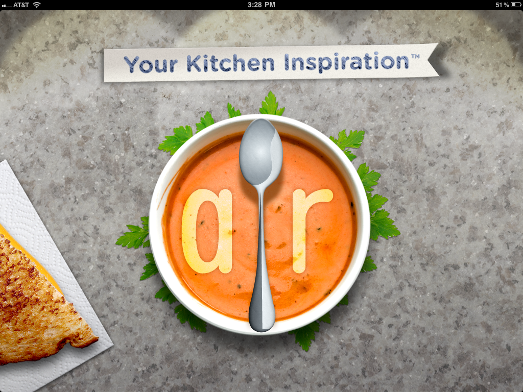
First, let me just say that I hate cooking. There’s work on either end, usually while hungry on the one side and lazy on the other. To me, the only thing worse than cooking is all the dishes you have to do afterwards. Anyway, I’ve found the AllRecipes apps are so well designed, the geek in me is soothed enough to make the cooking experience much more pleasant; almost, dare I say it, enjoyable.
The Verdict: Good Design!
The Takeaways:
- Designing for the total user experience is more relevant than ever with cross-platform applications, and doing a good job at this makes both Web and smartphone applications stand out above the competition.
- Excellent cross-platform functionality makes other design flaws easier to forgive.
- Leveraging communities brings additional value to information which could otherwise be found elsewhere.
The Details
AllRecipes has done a fantastic job of integrating their website, which clearly came first, with their iPad and iPhone apps. Keep Reading
GDBD: Bamboo Cat Grooming Glove
January 22nd, 2011

The Verdict: Good Design!
The Takeaway: As designers, we need to remember to go beyond the basics and think about the total user experience to always optimize, optimize, optimize!
The Details: The Bamboo Cat Grooming Glove is a rubbery cat accessory designed to work for both wet and dry grooming. It has two depths of bumpy rubber knobs on the “brush” side and a fuzzy cloth patch on the other for picking up loose fur.
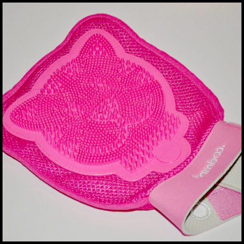
This product impressed me enough to write about it for one primary reason: Inside the glove attached to each side is a strap for holding smaller hands in place. This means the product designers thought about the needs of their entire user base, instead of just making assumptions based on their own or “average” hand sizes, or making multiple products for various users. Keep Reading
Book Review:
CSS Cookbook by C. Schmitt
April 5th, 2010

I was recently wandering the aisle of a bookstore when I came across the CSS Cookbook, 3rd Ed by Christopher Schmitt, published by the wonderful O’Reilly Media. Something about O’Reilly books always appeals to me; the detailed pen drawings of various animals and flat, solid colors always catch my inner designer and make me wonder what’s inside, even when the topic is some outlandish programming language I’ll never use.
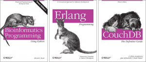
What’s inside? I’ll never know.
I picked up the CSS Cookbook and started thumbing through it to get a feel for the format. Every method had a problem (such as “You want to use multiple PNGs with alpha transparency”) a solution detailing the code, and a discussion explaining why and how the code works. Pleased with the overall layout, I flipped back to the beginning to have a look at the massive, seven page beast of a table of contents.
The book is laid out into logical sections (Web Typography, Images, Lists, Forms, etc.). In each of those sections I found CSS problem/solution pairs ranging from the very basic to the very advanced. It starts right out with “Picking a Text Editor” and “Coding a Basic HTML Page” on through “Applying Basic CSS Rules to a Web Page” and “Determining When to Use Class and ID Selectors,” but it doesn’t stop with the basics. Later on comes “Inserting Reflections on Images Automatically,” “Using Image Sprites,” “Creating Breadcrumb Navigation,” and “Styling a Screenplay with the HTML5 dialog Element.” Scanning the rest of the contents, I found myself growing excited to see things listed I wouldn’t have even thought to create with CSS. Of course I brought it home.
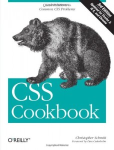
Most people would probably think of this book as a reference, though a Google search often reveals the answer faster than flipping through a book. Instead of putting it on my shelf waiting for me to question it, I decided to spend a few evenings reading through it. I skimmed the things I knew and bookmarked the things I didn’t, and I was reminded just how powerful a markup CSS can be with the right knowledge. The format is clear, the methods reliable, and the reasoning well-explained. I recommend it to anyone looking for a deeper understanding of CSS and how to leverage it to its full potential.
One thing I love about this profession is that there is always something new to learn. Whether a strengthening of the basics of principles and languages already known, a completely new technology, or something in between, there is always room for and push towards growth. What books have you found to aid you along your journey?


