Facebook really loves to play Popularity Police. If you don’t like enough of a Page’s posts, they stop showing in […]
GDBD: The AllRecipes Cross-Platform Ecosystem
Good Design Bad Design, Web Design
February 22nd, 2011
First, let me just say that I hate cooking. There’s work on either end, usually while hungry on the one side and lazy on the other. To me, the only thing worse than cooking is all the dishes you have to do afterwards. Anyway, I’ve found the AllRecipes apps are so well designed, the geek in me is soothed enough to make the cooking experience much more pleasant; almost, dare I say it, enjoyable.
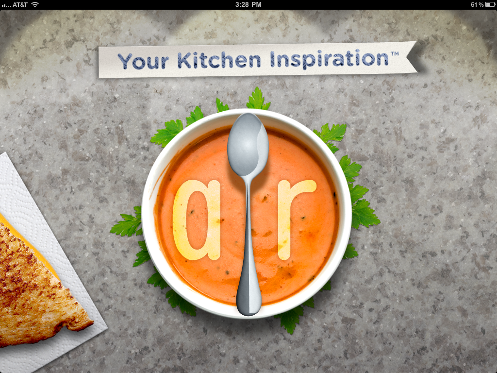
The Verdict: Good Design!
The Takeaways:
- Designing for the total user experience is more relevant than ever with cross-platform applications, and doing a good job at this makes both Web and smartphone applications stand out above the competition.
- Excellent cross-platform functionality makes other design flaws easier to forgive.
- Leveraging communities brings additional value to information which could otherwise be found elsewhere.
The Details
AllRecipes has done a fantastic job of integrating their website, which clearly came first, with their iPad and iPhone apps. Keep Reading
GDBD: Bamboo Cat Grooming Glove
January 22nd, 2011

The Verdict: Good Design!
The Takeaway: As designers, we need to remember to go beyond the basics and think about the total user experience to always optimize, optimize, optimize!
The Details: The Bamboo Cat Grooming Glove is a rubbery cat accessory designed to work for both wet and dry grooming. It has two depths of bumpy rubber knobs on the “brush” side and a fuzzy cloth patch on the other for picking up loose fur.
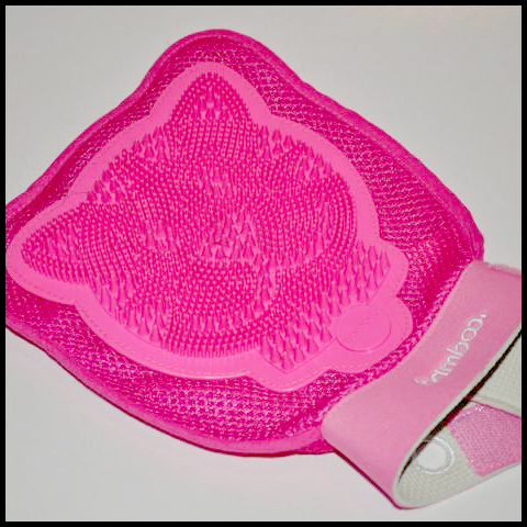
This product impressed me enough to write about it for one primary reason: Inside the glove attached to each side is a strap for holding smaller hands in place. This means the product designers thought about the needs of their entire user base, instead of just making assumptions based on their own or “average” hand sizes, or making multiple products for various users. Keep Reading
GDBD: Good Design, Bad Design
January 22nd, 2011
Ok, so I’m a designer, right? I go through my day and I see all kinds of little things that either drive me crazy or impress me with their design — and as an effort to get more in the designer headspace, I’m trying to notice them even more. Unfortunately, sometimes my husband just doesn’t get it when I start analyzing the layout of a billboard or crooning over the ergonomic rubber grip of a new kitchen utensil. Rather than boring him with all the gory details, I’ve decided to do a new little now-and-again segment here called “Good Design, Bad Design” (GDBD for short), in which I look at products, software, or whatever strikes my fancy and point out how awesome they are, or how much they suck and why.
I’m not trying to minimize the effort put in by the various product designers and UI experts out there, nor am I presuming my stamp of approval on their awesomeness means diddly squat. But just like a painter sees the world through a lens of composition and color palettes and a photographer starts thinking often of depth-of-field and lighting, as a designer, I’ve started seeing the world in terms of usability, aesthetics, and problem solving, and doing so helps me to do my own job better.
So, without further ado, I’ll get on to work on my first post in the GDBD series…
Total Experience Design – Why Should a Web Designer Care?
August 7th, 2010
This is a guest post graciously contributed by Paul Dawson, who spoke at MIX10 about Total Experience Design. He runs a consulting blog and is Experience Director at EMC Consulting, one of the largest digital interactive agencies in Europe and about to go global. EMC bought Paul’s previous company, Conchango, about three years ago. He’s been in “new media” since it was — “new” that is, working on early day websites and multimedia work from 1996. Now he works with clients like Tesco, Virgin Atlantic and Barclays on digital experience strategies, as well as making the rounds talking about EMC Consulting’s approach to design; particularly their “Total Experience Design” philosophy. Keep Reading
Critique: Pandora Radio’s Redesign
April 19th, 2010
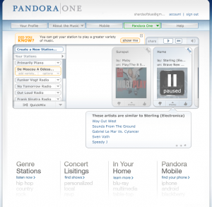
I’m a huge fan of the Internet radio service, Pandora. Headphones and good music are my retreat in the office environment in which I work, but I have a tendency to tire of music quickly and have little patience to search out more. As a result, the intelligent playlist generation of Pandora is truly a lifesaver for me. After spending so much time using the service and leaving my feedback through interaction with the company’s Twitter account, the whole brand is starting to feel like an old friend. That’s why when the site underwent a few tweaks to the design, I took notice. Here are some friendly thoughts and critiques.
Sharing and Such
The first change I saw was of the Pandora player control area in the upper right. The buttons themselves are slightly bigger and bolder, the volume control is more set apart, and the social sharing icons are hiding under the word “share”, to be shown on mouse over. Hiding the icons is a nice move; it cleans up the viewing area and removes dilution of the page with other brands. In addition, if Pandora chooses to add integration with more services, it will not add clutter to the visible page.
One possible consideration, however, is that some users may assume that “share” requires a click, not a mouse over event, and be deterred from pressing the ambiguous button, never even hovering over it to find out otherwise. As it used to be, the share icons were clearly evident, with no further user action necessary to discover the options available.
UPDADATE: This feature doesn’t work consistently. Not sure if this is because I’m browsing from a Mac (on Safari and FF3), or some other reason.
Rating: 3 out of 5
Fantastic Footer
The next thing I noticed was a change to the very bottom of the page. I truly don’t remember if there was anything like this down there before or not. The four faded columns are each single links to various other parts of the site, including “Genre Stations”, “Pandora Mobile”, “Your Profile”, and others. Each has a faded list below to clarify the topic and contains a short but compelling call to action (“listen now”, “find your phone”, and “check it out”, respectively). “In Your Home” is a particularly good move, showing faded out “blu-ray” and “multimedia” below, quietly but clearly informing users that they can access Pandora from devices other than the computer.
I think this entire section is a fantastic idea, since most users access only the home page to listen to their music, then leave without digging deeper into the site. The aesthetics are clean and well-executed, encouraging exploration of the site without detracting from the primary focus, the radio page itself.
Rating: 5 out of 5
Imperfect Information
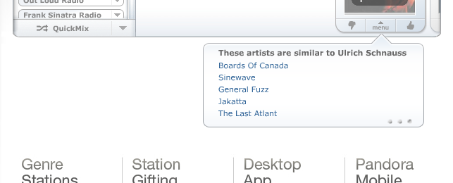
The final change was to the “song information” area of the page, and this one I’m not as thrilled with. The fixed-width area has been replaced with a variable-width upside-down “talk bubble” style of containing unit. When there is only very little information to display, the bubble shrinks in width, leaving a conspicuous blank white space to its left which breaks the flow of the design.
The clear tabs which once labeled song, artist, and “why was this song chosen” information have been replaced with tiny dots which the user must hover over to see where they go. This is neither an improvement to the aesthetics of the page nor an intuitive interface. “What are those dots?” a user might wonder, but who’s to say they will hover their mouse over the tiny pinpricks to find out? It is not a good move for accessibility, either; someone with functional but poor eyesight might not even notice the dots are there, and someone with limited motor skills may have trouble positioning the mouse just-so over them.
Finally, “why was this song chosen” originally included a list of song characteristics as identified in the Music Genome Project as well as a short list of similar songs. Now it has been replaced with a simple list, “similar artists”, a functionality which seems a downgrade to me.
UPDATE: Now that I’ve interacted with this for a few days, the smaller size of the window is also getting on my nerves. There just isn’t enough information in the new box.
Rating: 0 out of 5
Conclusions
- The best change to the design is undoubtedly the footer, which I believe will cause a marked increase in user site exploration and interaction.
- The social icon change is nice for aesthetics and brand preservation, but may cause a decrease in sharing.
- The song information area change is less user-friendly and doesn’t look as nice as the previous iteration.
Did I miss any changes? Does the new design have any other implications? What do you think?


