Facebook really loves to play Popularity Police. If you don’t like enough of a Page’s posts, they stop showing in […]
GDBD: The AllRecipes Cross-Platform Ecosystem
Good Design Bad Design, Web Design
February 22nd, 2011
First, let me just say that I hate cooking. There’s work on either end, usually while hungry on the one side and lazy on the other. To me, the only thing worse than cooking is all the dishes you have to do afterwards. Anyway, I’ve found the AllRecipes apps are so well designed, the geek in me is soothed enough to make the cooking experience much more pleasant; almost, dare I say it, enjoyable.
The Verdict: Good Design!
The Takeaways:
- Designing for the total user experience is more relevant than ever with cross-platform applications, and doing a good job at this makes both Web and smartphone applications stand out above the competition.
- Excellent cross-platform functionality makes other design flaws easier to forgive.
- Leveraging communities brings additional value to information which could otherwise be found elsewhere.
The Details
AllRecipes has done a fantastic job of integrating their website, which clearly came first, with their iPad and iPhone apps. Rather than simply repeating the same experience across platforms, they have managed to leverage the strengths of each medium to create solid, useful, pretty applications that truly improve the cooking experience. They cover the entire experience, from “what to cook” inspiration, to creating a shopping list, to doing the actual cooking, and finally to repeating things you enjoyed cooking. This is truly Total Experience Design!
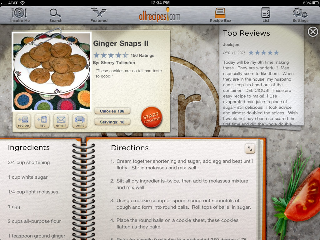
The recipes themselves are obviously the star of the show, whether they’re being accessed from the website or the apps, and this is where AllRecipes shines. Each recipe is rated and reviewed by an active, knowledgeable community. The reviews nearly always contain suggestions for improvements, cautions, or customizations and become an indispensable part of the recipe itself. Note that this brings value to AllRecipes itself beyond simply being a giant, searchable cookbook.
The Website
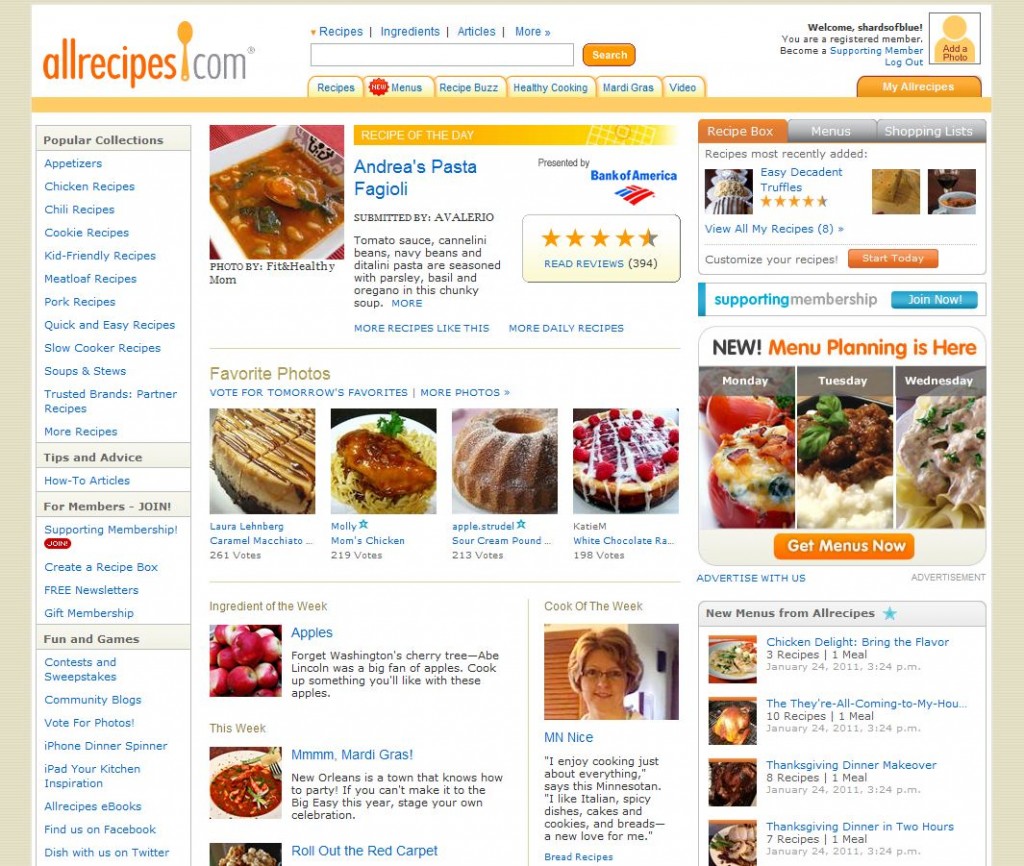 I’m going to start right off talking about the AllRecipes website, the visual and information design of which is the weakest link the whole ecosystem. The site’s organization isn’t very intuitive and feels very much like information overload upon first visit.
What I want to see is this:
- A clear list of recipe categories to browse
- My own “recipe box”, shopping lists, and reviews
- A link to a how-to cooking tips articles section
- A link to access community features
What I get is an avalanche of information, including:
- “Popular Collections”
- “Fun and Games”
- “Recipe of the Day”
- “Favorite Photos”
- “My AllRecipes”
- Cook and ingredient of the week
- “How-To Articles” (yay, that’s there)
- A flashy ad for the “Menu Planner”
- A top navigation with none of the things I’m looking for
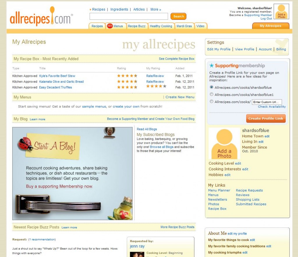 The iPad and iPhone apps are poorly promoted, hiding in a long list under “Fun and Games”. Even the “My AllRecipes” page is overloaded and always too many clicks away from what I’m looking for.
That being said, the website is not entirely bad. Eventually I find everything I’m looking for, and the color pallet is quite nice. The actual information included on the site, once found, is excellent. Their search feature is right where it should be on the home page and proved to be more robust than I expected, letting users search broad categories and drill down through narrower ones, including a search restricted by nutritional values.
Now, let’s get on to the really interesting bit, shall we?
The iPhone App
![]() The AllRecipes apps themselves are fantastically designed. The free version of the iPhone app is called the Dinner Spinner, which is a fun little recipe idea randomizer but in and of itself not terribly useful. The paid version (“Dinner Spinner Pro”) is where things get interesting, however, because this is where the syncing across platforms happens. It rings in at $2.99, which seems like a bit much by itself, but when it’s paired with the website and iPad app it quickly earns its keep as a one-time expense.
The AllRecipes apps themselves are fantastically designed. The free version of the iPhone app is called the Dinner Spinner, which is a fun little recipe idea randomizer but in and of itself not terribly useful. The paid version (“Dinner Spinner Pro”) is where things get interesting, however, because this is where the syncing across platforms happens. It rings in at $2.99, which seems like a bit much by itself, but when it’s paired with the website and iPad app it quickly earns its keep as a one-time expense.
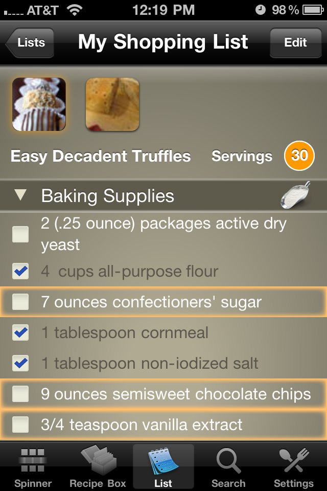
I can’t over-emphasize how useful this app is to me in the grocery store. Since the listmaking can be automated based on recipes, I don’t have to worry about forgetting to add an item. Not only that, but since I have full access to everything while I’m on the go, I can double-check the reviews and comments, cross-reference with similar recipes, or add a side-dish if I suddenly realize I’m missing one.
This app is a real solution to a real problem I didn’t even think about solving myself: namely, that I can’t bring along to the store my entire cookbook library and a few hundred knowledgeable friends.
Using Dinner Spinner Pro for cooking works well, too. However, the AllRecipes ecosystem really shines when you add in the iPad app at the time of cooking.
The iPad App
![]() I expected a slightly redesigned version of the Dinner Spinner for the iPad, but what I got with AllRecipes’ “Your Kitchen Inspiration” was something built entirely for the new platform (no props for the name, though). There is still an “inspire me” tab, with a rather slow moving collage of suggestions that I use about as much as the dinner spinner (i.e. none), though I’m sure others find suggestions useful.
I expected a slightly redesigned version of the Dinner Spinner for the iPad, but what I got with AllRecipes’ “Your Kitchen Inspiration” was something built entirely for the new platform (no props for the name, though). There is still an “inspire me” tab, with a rather slow moving collage of suggestions that I use about as much as the dinner spinner (i.e. none), though I’m sure others find suggestions useful.
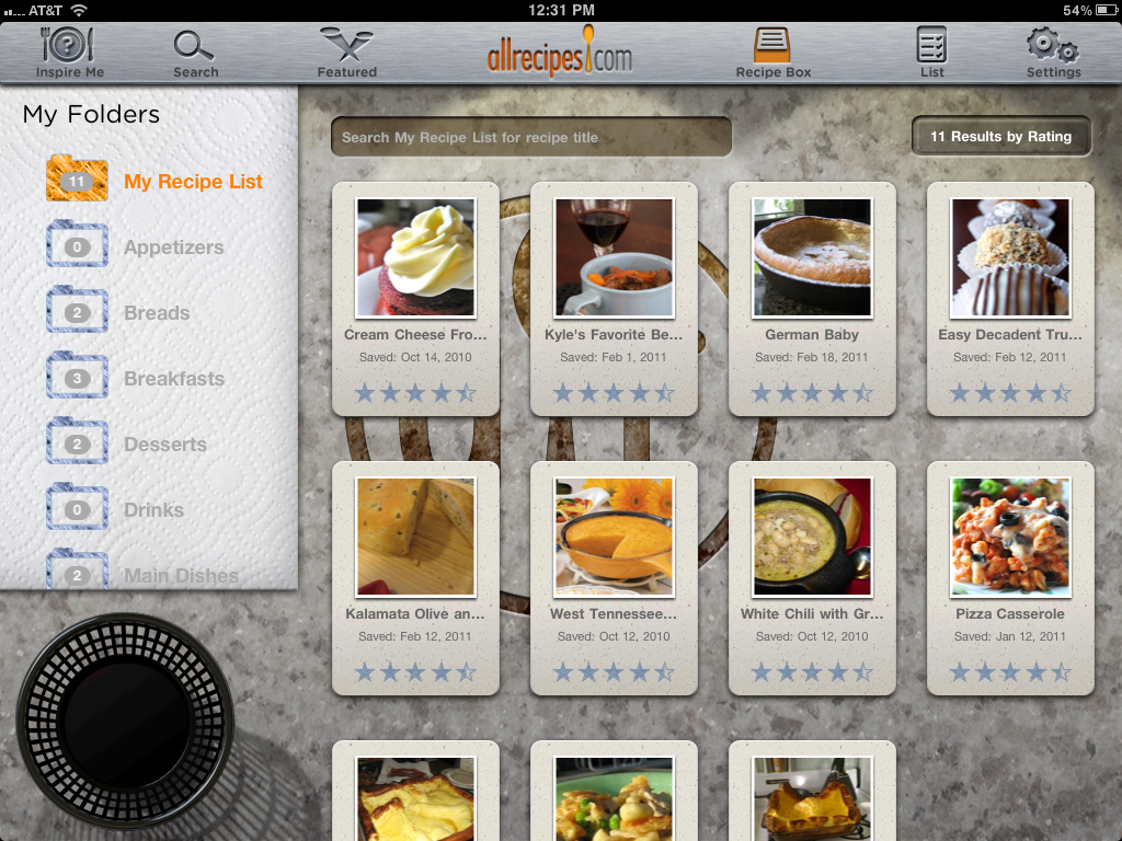
Where this app really shines is in the Recipe Box and in search. I actually prefer searching through this app to using the website due to a prettier UI and more friendly filtering.
Once I find a recipe I like, I can add it to my Recipe Box and shopping List, and it syncs with the app on my iPhone right away. Cumulatively, this has saved me loads of time previously spent typing in each ingredient from a cookbook into a list app (or just taking a picture of the recipe when I’m in a hurry).
AllRecipes clearly didn’t expect users to bring the iPad itself to the store as their shopping list, since the List feature here isn’t designed for quick scanning like parallel feature for the iPhone is. While it could be a bit more user-friendly (there’s a lot of wasted space and missing features), I find the differences almost encouraging since they clearly thought about the usefulness of each feature for the particular platform before dumping design time into it.
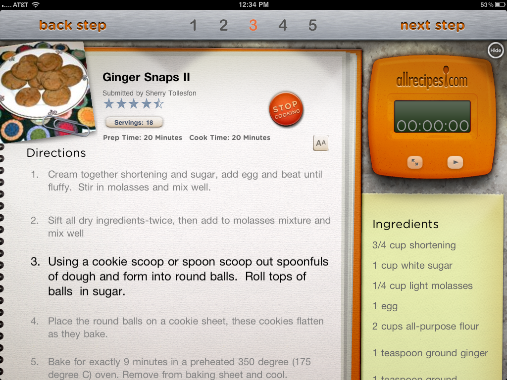
Cooking itself is fantastic with the app’s highlighting of steps and relatively quick access to the comments and reviews throughout the process, though unfortunately you must leave or hide “cooking mode” in order to see them.
Again, to get all the lovely Recipe Box and List features you have to pay to upgrade, this time $4.99, bringing the total investment for the iPhone and iPad apps combined to about $8.00. However, since most cookbooks range in price from $20-$60 and are far less robust, I considered this money well spent. The website also has a paid option, but thankfully that’s only for power features like custom URLs and blogging for true cooking enthusiasts.
The Conclusion
The folks at AllRecipes have some app designers that know what they’re doing. Although various aspects of the experience have room for improvement, the overall functionality of the ecosystem improves the entire cooking experience, even for a cooking “hater” like me.
From search and suggestions, to shopping, to cooking, and finally to creating my own library of favorite recipes, every aspect of the cooking experience has been covered. A knowledgeable community has been leveraged to add value beyond that brought by the AllRecipes own staff and database. They have truly designed for the total user experience, and we could all learn a bit from them!



Nice review Roxanne! Obviously love the reference to Total Experience!
I worked on a product (not yet in the market) recently that had similar themes in it, and one of the challenges was how you use a device in the kitchen without grubbing it up with grease or flour. We had our own answers, but so did users – for example one guy cooked with his Macbook pro in the kitchen, but he covered it clingfilm first! Creative… although not what Jonathan Ive had in mind I guess!
Glad you liked it! I’m really coming to appreciate products that think about every step of whatever process they’re engaged in. You’re right about the messiness of cooking around devices, though at least the iPad is easy to clean with no keyboard to trap grit. I’m interested in what your solutions were; would love to hear about the finished product!
Cross platform? In an incredibly narrow definition of that term. It’s bi-platform if you are generous and calling iPad and iPhone two separate platforms.
I need a recipe that *IS* cross platform, that handles iWhatever, Android, and my desktop/laptop OS’s (Linux, OS X, and even Windows.)
Not possible? too difficult? Heck no… just have the program be browser based. Browsers can read local, networked, or web based dataand do what they gotta do.
This is an iApp. That’s it. No good for a lot of us.